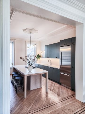
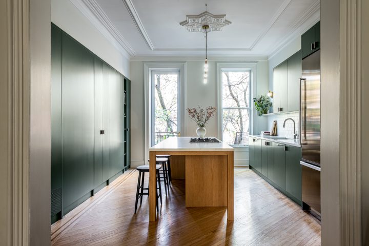
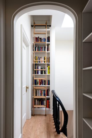
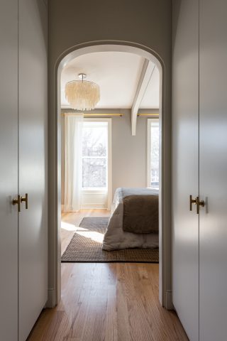
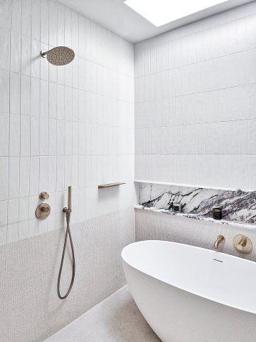
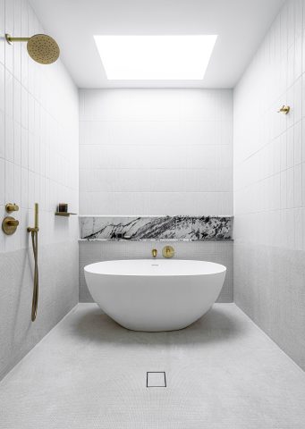
A crucial part of the design process involved determining which elements of the existing conditions could be salvaged.
Tom Klaber
The building was in less-than-ideal shape. While the initial structure showed signs of quality work, later renovations weren’t as well done. These changes, combined with age, had significantly affected the building’s state. Our first task was determining which parts of the original building could be kept. After this analysis, we went about the schematic design process, where it became clear that a good portion of the program would have to be rearranged.
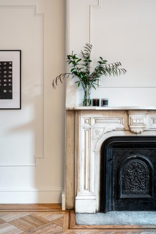
We playfully called the this phase ”adaptive reuse” as we looked at how the spaces and aspects of the original detailing could be re-purposed for the new program. The outcome was a rejuvenated space, combining modern functionality with its historical foundation. The outcome was a rejuvenated space, combining modern functionality with its historical foundation.
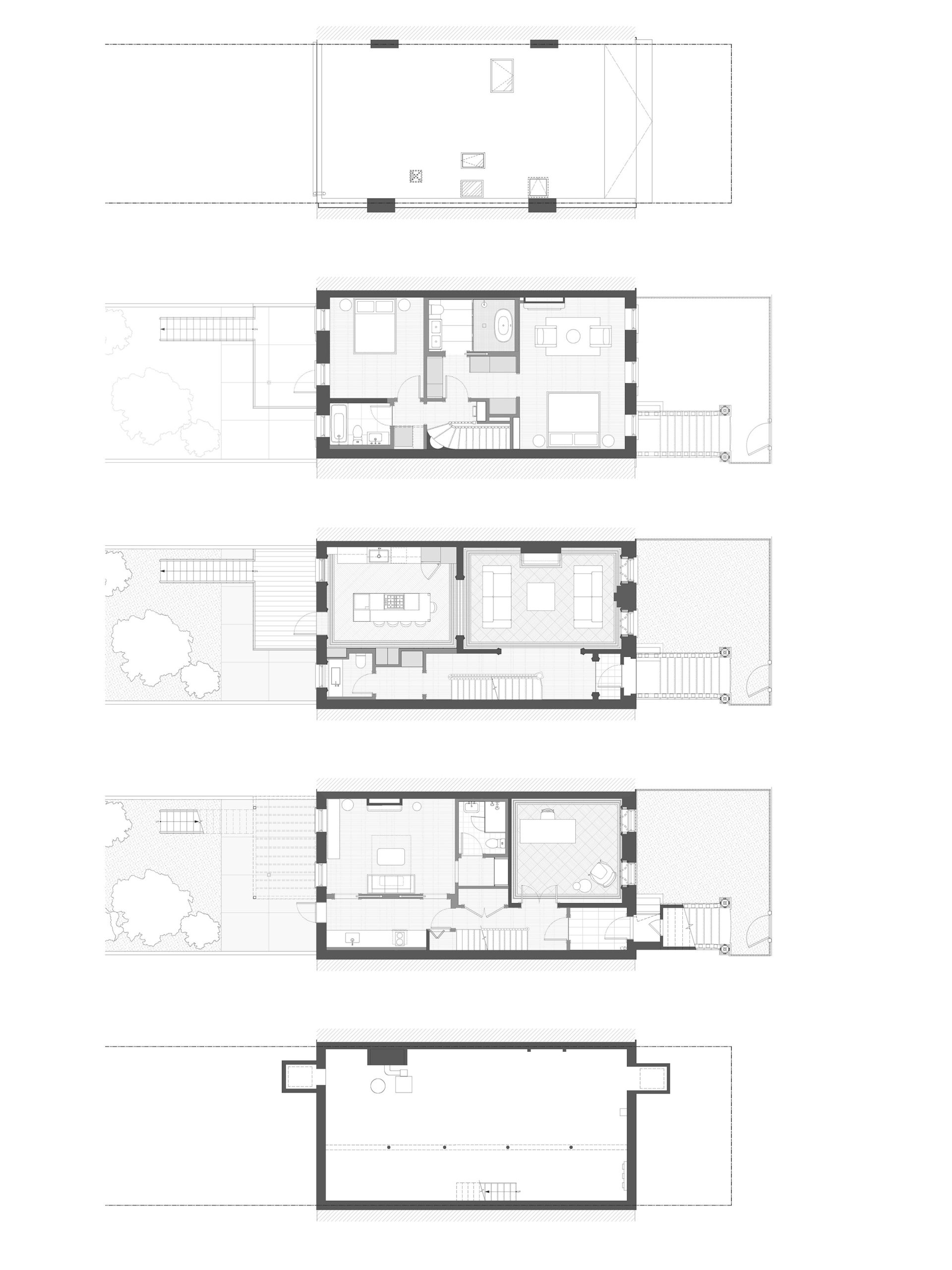
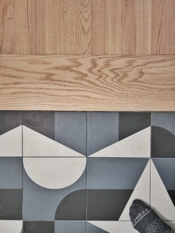
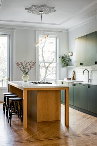
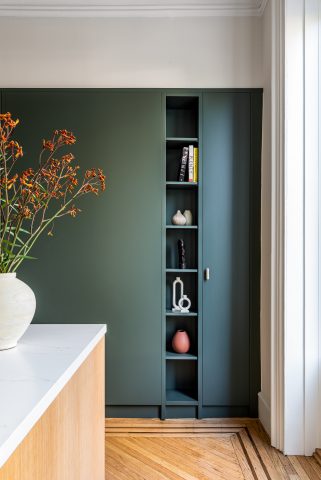
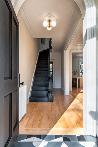
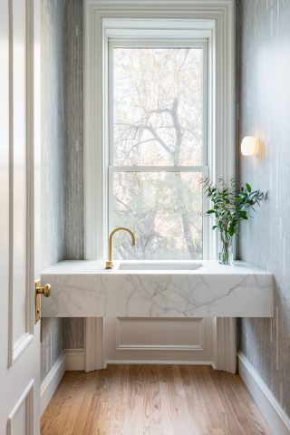
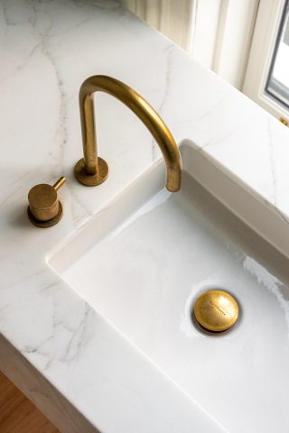
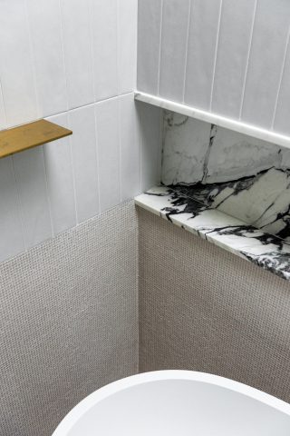
Finalizing the new palette was a intricate challenge. Our aim was to craft sophisticated spaces that were rich with texture, while retaining a touch of vibrant charm. Public areas, like the entryway and kitchen, strike a playful chord. In contrast, the bathrooms and primary bedroom embrace a more re ined palette.
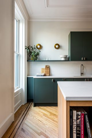
Integrating this fresh palette with the building’s original detailing proved pivotal in achieving a cohesive design narrative. The detailing of the past, paired with our modern selections, fostered a harmonious blend, grounding the new program within the structure’s historical context. This synergy ensured that these new spaces not only felt contemporary but also resonated with the building’s past.
Texture and depth defined our modern palette. Finding impactful moments to deploy these was key to working with the budget.


